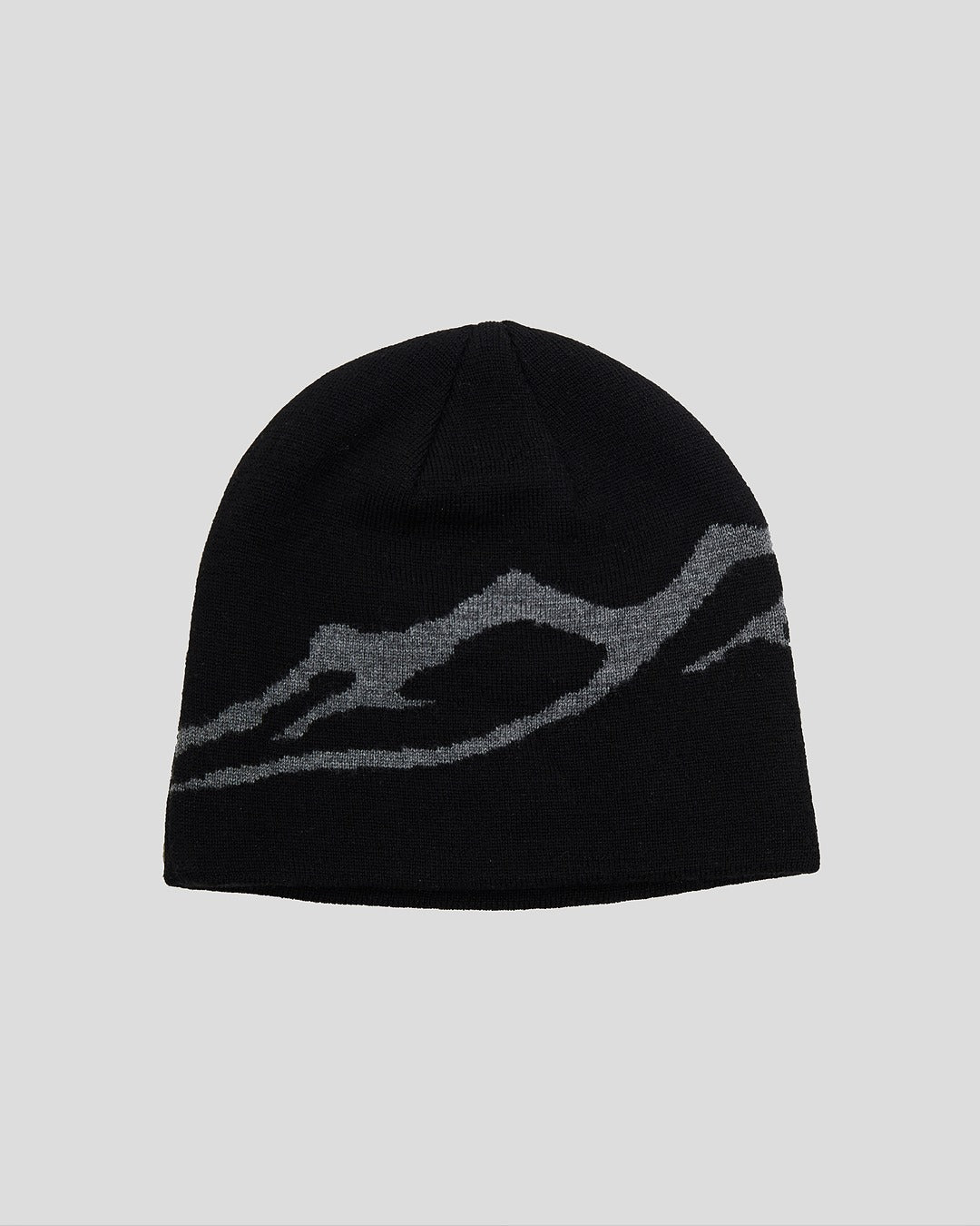
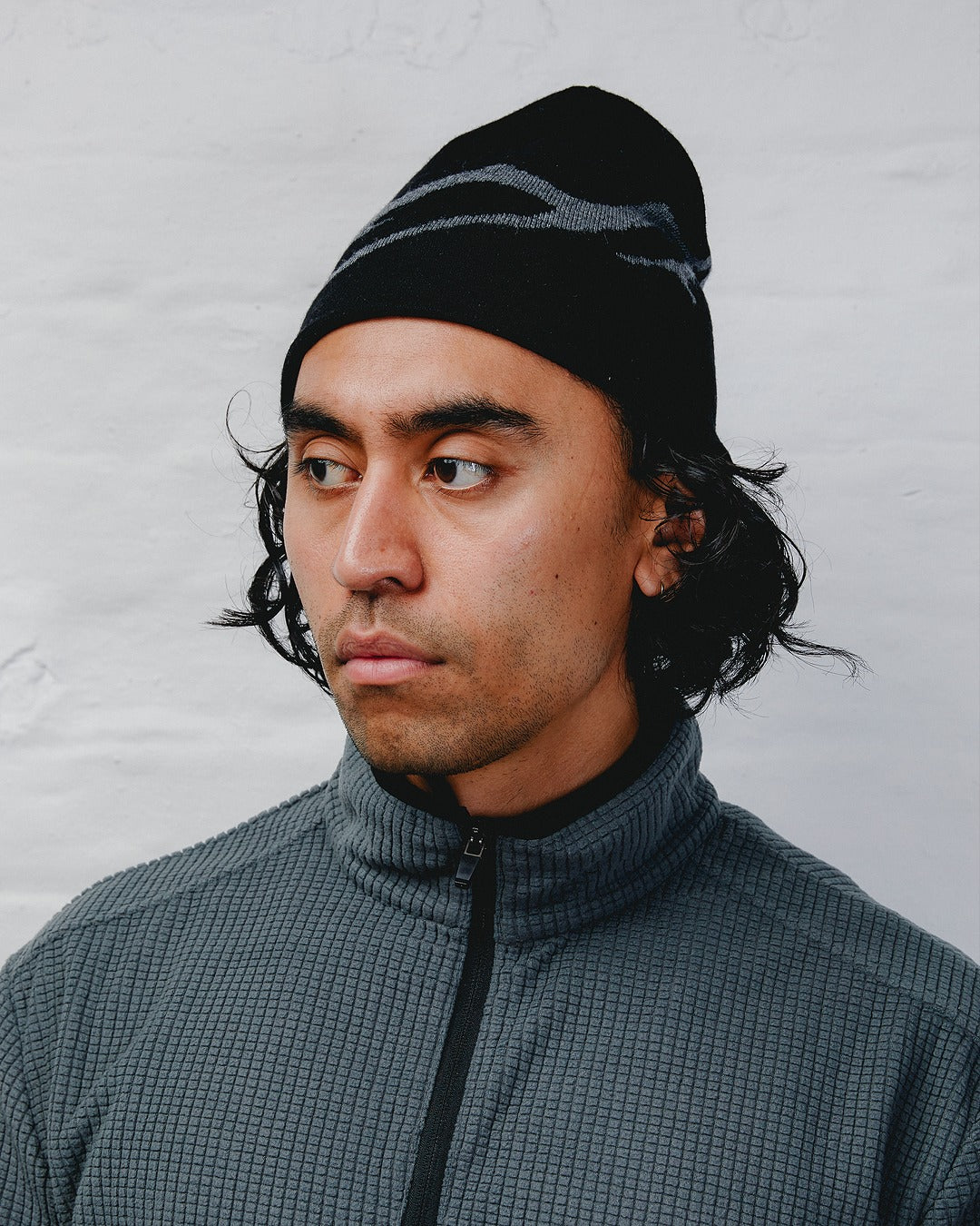
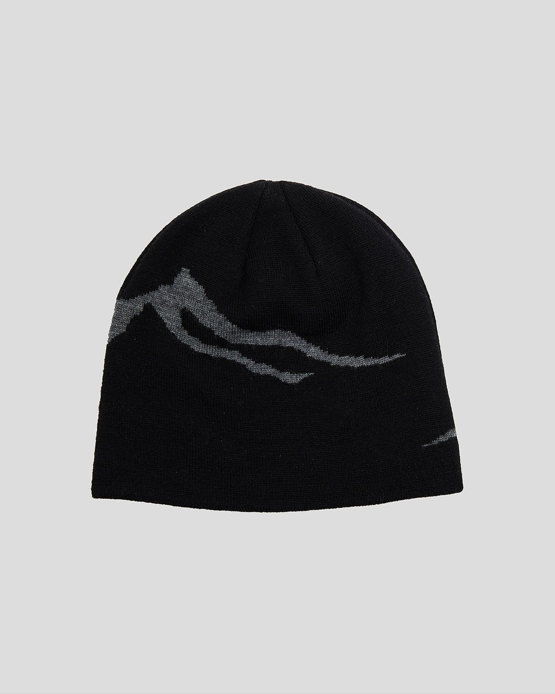
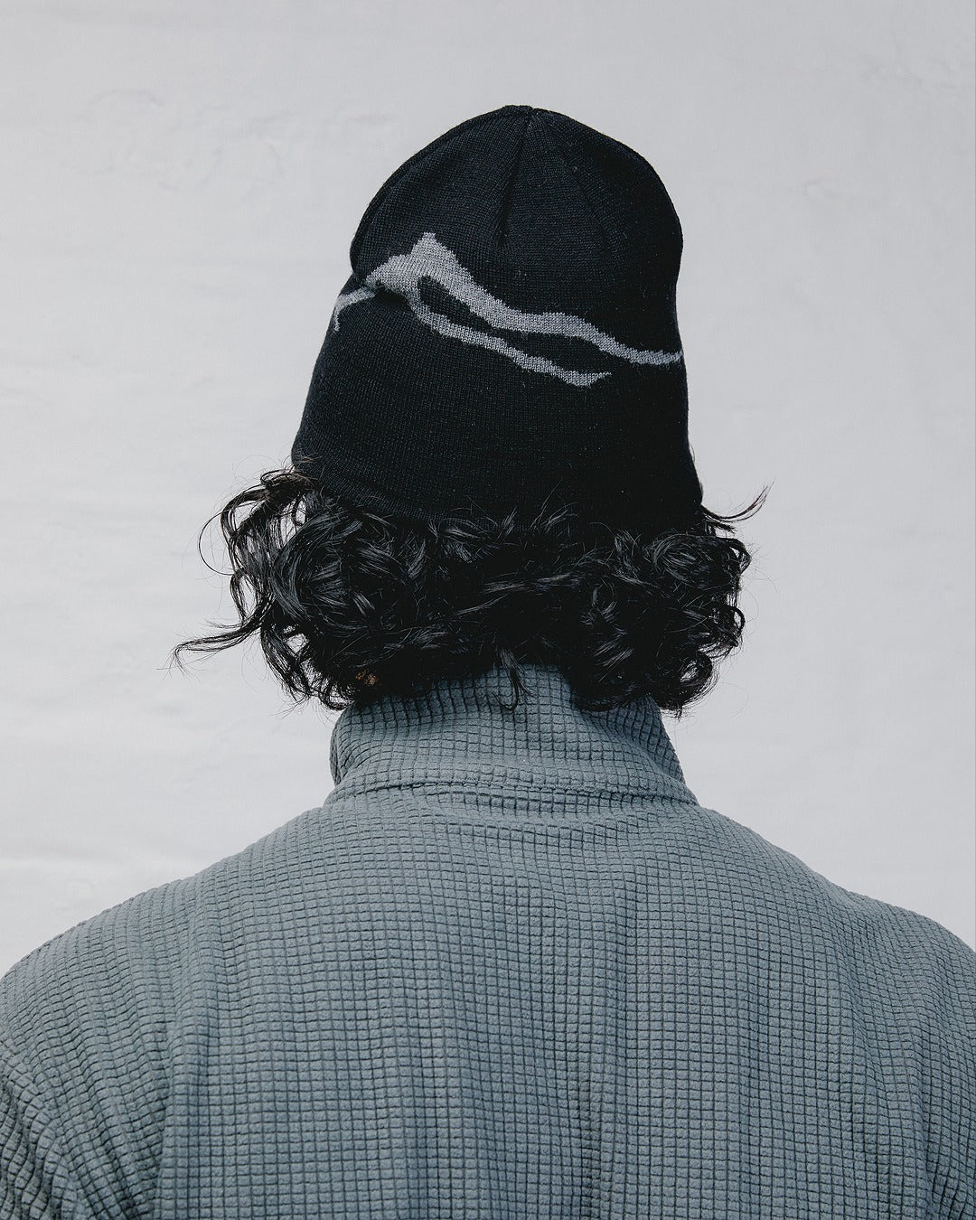
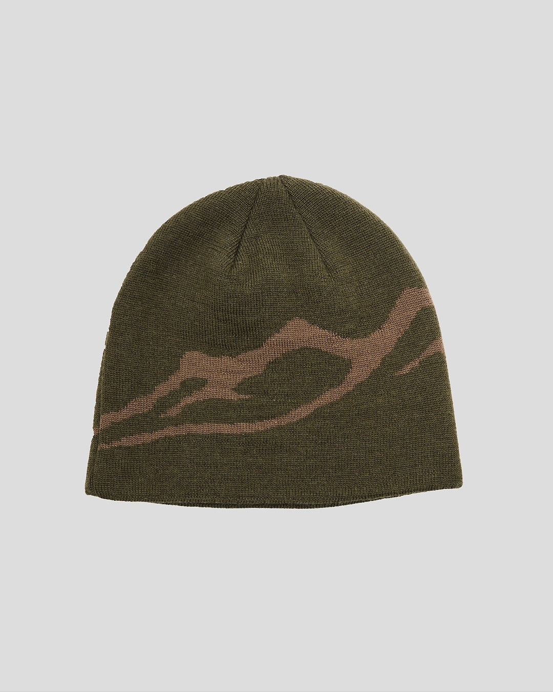
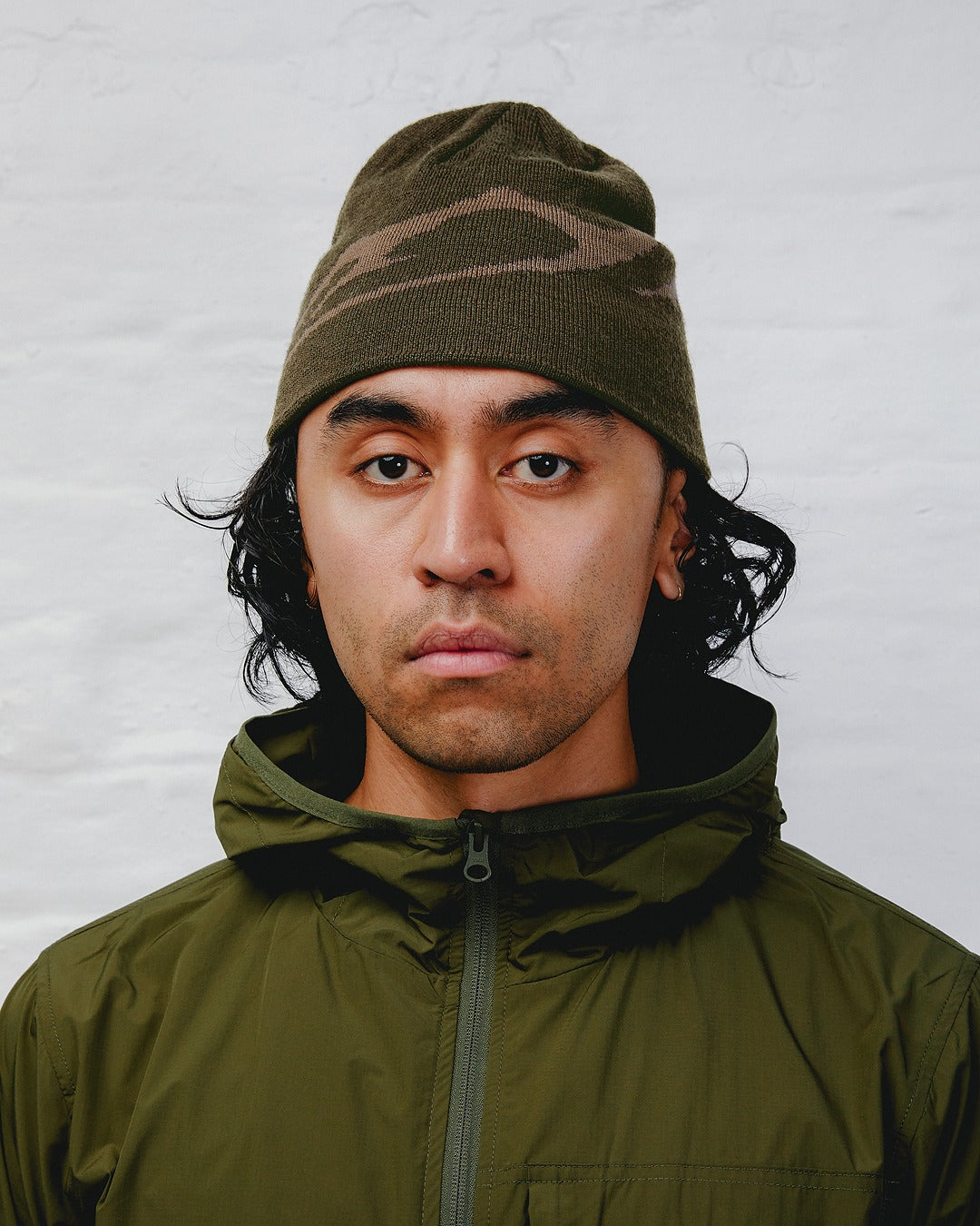
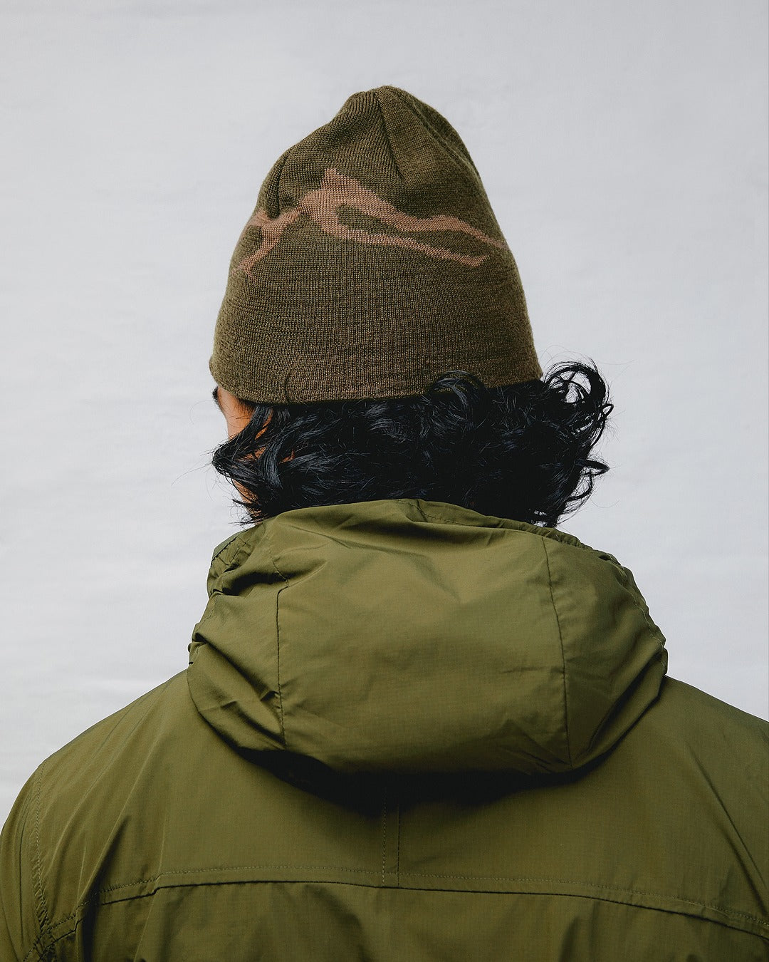
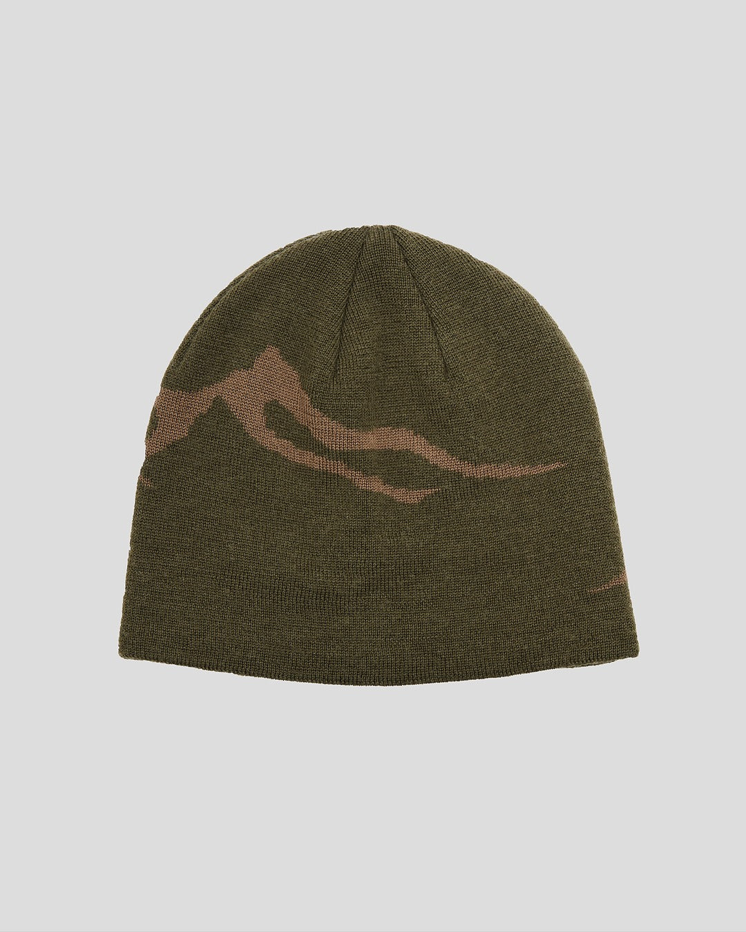
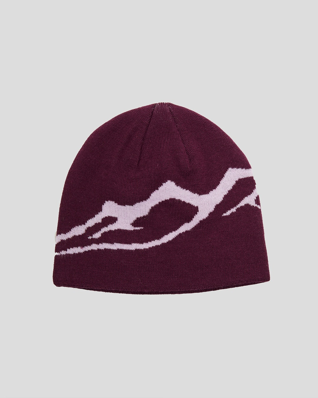
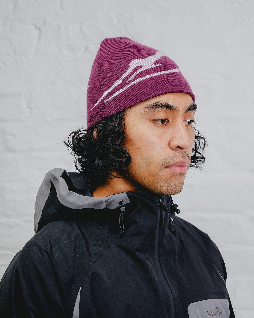
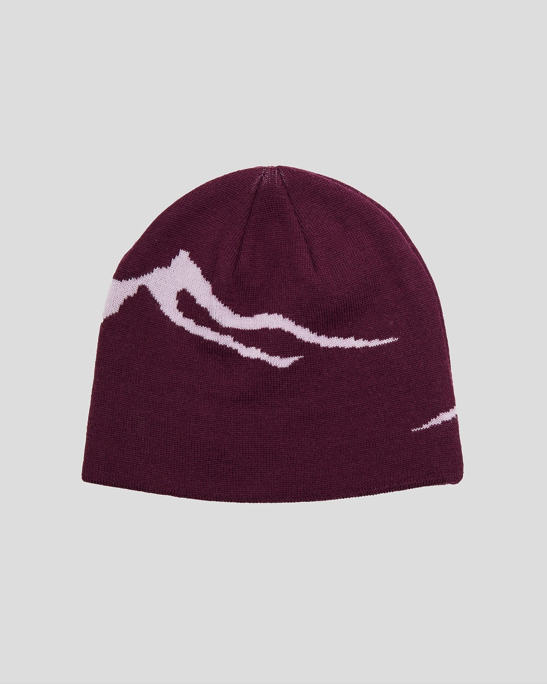
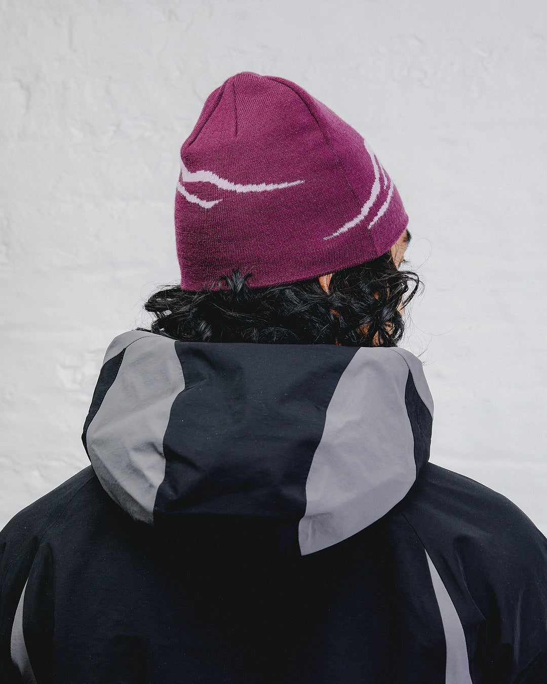
Earlier this month we had the pleasure of Speaking with Jonathan Castro at this year's Dekmantel Festival. Jonathan is a graphic designer and artist from Peru, now living between Amsterdam and Rotterdam. His work is all about building visual languages that mix images, archival materials, and sound, pulling from the places and cultures that have shaped him.
Starting from Dekmantel 2024, he reimagined the festival’s visual identity, blending the expressive design of the Amsterdamse Bos bridges with the loud, colourful spirit of Peruvian Chicha posters. The result is a world of visuals that feel playful yet meaningful, rooted in history but alive with energy.
We asked Jonathan a couple questions whilst we had some time with him at the festival, here's what he had to say.
Firstly, tell us a little bit about yourself and what your role involved for this year’s Dekmantel festival?
Sure! First things first—I want to thank Casper, Bas, and Joke for commissioning this project back in 2023 and trusting me with something that has since become very special and close to my heart.
I’m Jonathan, a graphic designer and artist from Lima, Peru, now living between Amsterdam and Rotterdam. My practice revolves around creating and assembling visual languages using images, archival materials, and sound. Since Dekmantel 2024, I’ve been responsible for the overall visual identity—everything from the city pillars, video announcement, posters, and digital visuals, to on-site signage and even parts of the merch. Basically, anything visual that helps shape the ecosystem and aura of the festival. As I mentioned before, this body of work came to life thanks to many collaborators. Shoutout to my team!

What was the inspiration or narrative behind the visual direction for Dekmantel this year?
The identity was inspired by the Amsterdam School of Architecture—especially the wonderfully strange and expressive bridges in the Amsterdamse Bos, one of the festival’s main locations. I loved how bold, eccentric, and rooted in history they are. They feel like fiction and function at the same time.
At the same time, I wanted to bring in something more personal—so I combined that with the energy of Chicha posters from Peru. These loud, colorful, and unapologetically graphic street posters are tied to Andean culture and local music scenes. So in a way, this identity became a visual meeting point between the two places I’m connected to: the city I live in, and the one I come from.
What was the most difficult part of rebranding a festival that already had such a strong visual legacy?
Honestly, finding the balance. Dekmantel already has a respected and well-defined visual and sonic identity. The challenge was to build something fresh that still felt true to the festival’s essence.
I didn’t want to feel decorative—I wanted the design to carry meaning. That’s why we focused on the relationship between the festival and the city. It felt important to reflect Amsterdam’s layered history and make that visible to the audience—especially for those visiting. Not just another electronic music festival, but a space that also speaks about place, context, and memory.

Dekmantel’s branding lives across so many different platforms such as posters, merch, stage visuals and the website. How do you ensure consistency without being repetitive?
I think it starts with building a flexible visual language rather than rigid templates—and also having a very open client! Once you define a core vocabulary of forms, colors, textures, and ideas, you can play and experiment while still keeping everything unified.
For Dekmantel, we made different logos, icons, shapes, textures, and intentionally “off” color combinations to keep things a bit challenging and fun. Each format—whether it was a poster or a digital asset—had its own personality, but everything shared the same DNA.
Is there a specific detail in the last 2 year’s visual identity that you’re particularly proud of, maybe something most people might not notice?
Hmmm, I am proud of everything we've accomplished as a team, but if I had to mention something, that would be the tension. There’s a strange tension in how we combined things: shapes that defy the grid, the warping logos and titles, colors that feel like they shouldn’t work, but somehow do. That energy of assembling unlikely elements and still creating something coherent—that’s very much what I love. And I really hope it speaks to people.

The announcement video for this years festival felt very abstract but still engaging. Tell us a little more about the video content for this year’s festival and why it was so important?
The idea behind the short film was to capture the quiet mystery of the forest at night—how it transforms into something dreamlike, both real and imagined. A space where the path seems endless, shadows stretch, and everything feels slightly out of time.
It was originally used as the video announcement for Dekmantel Festival 2025, setting the tone for this year’s identity and atmosphere. We shot it on old VHS cameras together with Ted Grindei and Evi Cats, to bring in texture and depth—knowing the stills would later become part of the broader visual language of the festival. That grainy, ghostlike quality became a key ingredient—something that would break the smoothness of the graphic system and add contrast and rhythm to the identity. We didn’t want a surface that felt too clean or too perfect. We wanted something that echoed the forest itself: layered, organic, and alive.
Dekmantel is full of people expressing themselves through fashion and styling, why do you think there’s such a strong connection between music and fashion?
I think it's because both are languages of identity. In a place like Dekmantel, where there’s this shared sense of energy, inclusiveness, and freedom, it makes total sense that people express themselves through how they dress, move, and dance. Those collective experiences have been inspiring to me since the first gig I ever attended when I was around 14.

Do you have any new upcoming projects that you can tell us about?
Yes! I’m working on a few exciting things with record labels and cultural institutions, plus something I’ve been putting off for way too long: finishing an EP. It’s a mix of broken salsa and ambient textures, built from field recordings and old loops I’ve produced. Let’s see if I finally manage to get it out there hehe.
Outside of creative work, what do you like to spend your time doing to wind down?
Visit record shops, hanging out with friends, and making music for fun. I also visit my best friend’s cats regularly. I used to live with them, and I’m still completely in love with them!
Where to find Jonathan's work: Instagram / Website
Photography: @aaronjrdavies / @nikolaevalina


